Question
How can the delight of exploring a brick and mortar store be integrated with the convenience of shopping online?
Research Process
Contextual inquiry at local toy stores revealed that customers prefer brick and mortar stores for exploration and online stores for speed and convenience. “I just love when something unexpected jumps out at me,” explained one man; “its so quick and easy to shop online,” said another.
Design Strategy
Respect the conventions of online shopping while integrating delightfully surprising elements to provide convenience and encourage exploration on one platform.
Suggestions
1. Search bar given prominent position extending across the whole header at the top of the page.
Research Process
User research lead to the initial insight that people go online when they know what they want. Through a process of iterating through multiple low fidelity prototypes and testing them with people, I found that search lead people to their desired product more effectively than browsing.
Design Strategy
People go online when they already know what they want to buy. Placing the search bar in the header with the global navigation makes it always available, while giving it visual prominence by extending it across the whole page draws a user’s eyes creating a strong affordance to find what they want and buy it.
2. Products categorized conventionally as well as by their ability to make one move, imagine, or learn.
Research Process
A list of toys was sorted using both online and in-person open card sorts. I organized the resulting categories to reduce their number. After several iterations, I settled on an organization based on the toys’ ability to make one imagine, move, or learn. I validated this organization through numerous closed card sorts.
Design Strategy
Organizing the toys based on what they make us do asks us to consider what kind of interaction we are looking for, engaging us and creating emotional investment to encourage us to explore further. Not wanting to alienate anyone, however, I coupled this with more conventional categories to maintain accessibility.
3. Related and intentionally unrelated products displayed in search results and ‘Magic Box’ to encourage exploration.
Research Process
I discovered that people prefer physical stores for exploration because they love finding unexpected things on the shelves. Could this experience be brought online? Testing several low fidelity prototypes containing different ways of presenting unexpected products allowed me to hone in on the most delightful and accessible way.
Design Strategy
Discovering the unknown brings the thrill of exploration. While efficient, predictable organization and presentation of products in online stores make navigation easy, they preclude any such thrill. Presenting related products respects a necessary convention, while showing unrelated products allows for the delight of finding something unexpected.
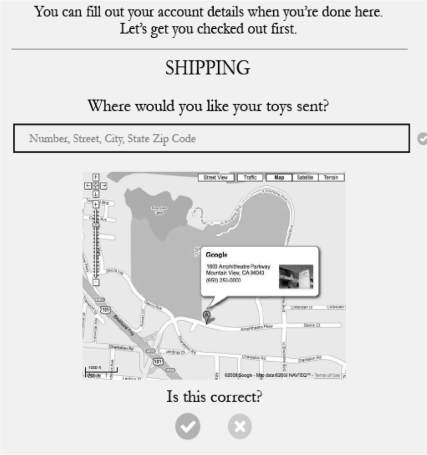
4. Checkout process reframed as a conversation to maintain convenience while creating a personal feeling.
Research Process
The business demanded an online platform without compromising their brand identity. In analyzing the competition I identified a trend of sterile efficiency - companies have made it exceedingly easy for customers to give them money. Interviews and usability tests with low fidelity prototypes uncovered a desire for a more personal approach.
Design Strategy
Traditionally, e-commerce platforms are about quantity and price instead of quality and service. Framing the checkout process as a conversation integrates the more intimate feeling of local, family owned business with the advantages of an online platform.